
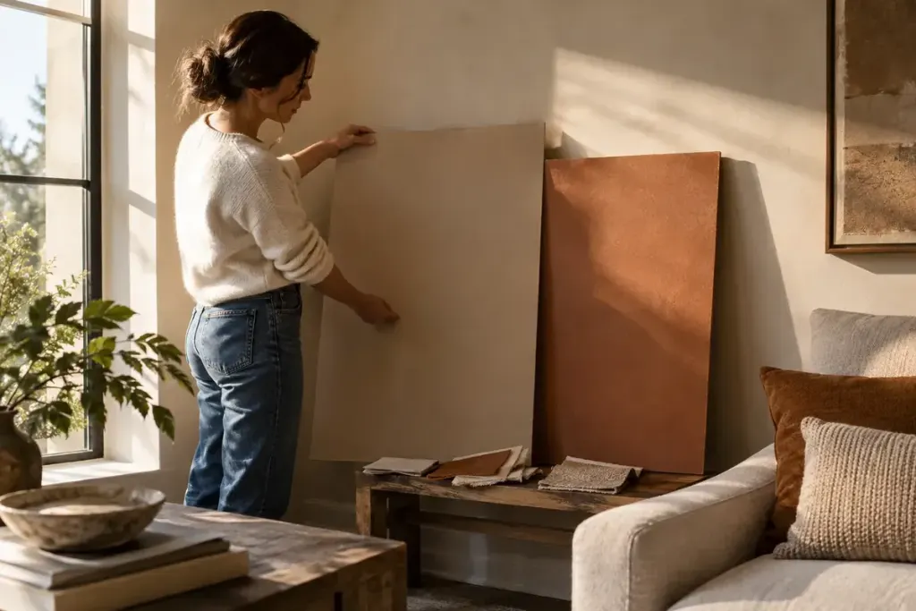
A small colour card can make a decision feel settled. Then the same shade appears pink beside the flooring or dull under the evening lamp. The room has joined the conversation, and it has more to say than the shop display.
Before buying enough paint for a full room, make a small comparison in the space itself. You are looking for a colour that works with the light and finishes you actually have, not a perfect match to a photograph on a phone.
Bring the fixed materials into the comparison
Start with the elements unlikely to change: flooring, a large cabinet, stone, tiles or a sofa you intend to keep. Place the candidate colours near these materials. A shade that looks balanced in isolation may become an awkward neighbour when the whole room is visible.
Choose a short list rather than covering the wall with every option. Too many neighbouring colours can make it difficult to remember which relationship you liked. Give each sample a clear label on the back and keep the product information separately.
Move the sample through the room
Benjamin Moore’s sampling guidance suggests using a movable board to view a colour in different locations and lighting. It also notes that sample paint is intended for colour evaluation, not long-term surface performance. Check the instructions for the sample product you use.
Compare the board near the window, in the quieter corner and beside the largest fixed finish. Keep it oriented like the surface you intend to paint. A wall colour viewed flat on a table is not being seen under the same conditions as a vertical wall.
Look at the times that matter to your routine
If the room is mainly used after work, do not choose solely from a sunny morning view. Check it with the lamps and bulbs you normally use. Note the weather and approximate time so a later comparison has some context.
For an illustrative example, two warm neutrals may look similar at midday. In the evening, one may seem to compete with a reddish wooden floor while the other feels quieter. Write down that relationship instead of trying to declare one shade universally warmer or better.
Keep finish and product suitability in the decision
A colour sample does not answer every purchasing question. Ask the manufacturer or supplier about the finish, substrate preparation, intended room and maintenance requirements. Follow the product’s ventilation and drying instructions, and consider how sheen may affect the final appearance.
Do not disturb an unknown old coating simply to create a test patch. Older surfaces can need assessment before sanding or removal. A movable sample can help with the colour decision while leaving that separate preparation question for the appropriate professional.
Make a note you can take to the counter
Record the exact colour reference, product range, finish and where you intend to use it. Keep your preferred sample with the notes. Similar names across different ranges do not necessarily identify the same product.
Give the shortlist time in the room, then choose from observations rather than memory. The useful result is a colour you understand in your own space, with fewer surprises when the whole wall is finished.
A colour decision belongs beside the rest of the room plan; also test the space around new furniture.